
[vc_row][vc_column][vc_column_text]
If I tell you: “Imagine a financial report”, what will come to your mind? A table full of numbers, colorful diagrams or wild 3D effects and speedometers? Whatever you envisioned, it will differ from your colleague’s notion, let alone a vision of another company’s employee.
Modern tools offer infinite possibilities for creating interesting visual presentations. However, it doesn’t mean the comprehension of the final picture gets easier. Each company daily creates tons of new and updated financial analytics. Where are they going? That’s right, to a manager. He or she must read (unlikely) and understand (nigh impossible) each of these works promptly. But it takes up a lot of time, money can be lost and important decisions are much harder to make.
“Can you help it though?”, you’ll shake the head.
Sure! Some companies have solved this problem, thanks to International Business Communication Standards (IBCS). Developed and refined by Dr. Rolf Hichert and his collaborators from the IBCS Association, the standards normalize the format and coloring of various data. This revolutionary set of rules and recommendations is called “traffic signs for management”. They have taken Europe by storm and organized data visualization in companies like Bayer, Philips, Coca-Cola, BMW, etc. If you look at their current reports, you’ll immediately see the advantage:
The information density seems high, yet its structure makes interpretation effortless. The viewer pays attention to what’s essential, i.e. the difference between budget and actual results. That’s because IBCS offers a consistent system of shapes, colors, fonts, and terminology. But let’s take a step back to look at the big picture.
Why do we need communication standards?
They make life easier. We’re able to reach conclusions faster, act more efficiently. Upon noticing a traffic light you decide right away.

The red light means stop, the yellow one announces the switch of signals, the green one allows proceeding. You can go to Sweden or Australia, but everywhere you’ll meet the usual device with familiar colors. Even in Japan, where instead of green you can see blue, it still resembles the former.
We learn this as children, and the knowledge stays with us forever because the rules don’t change. So we’re able to take measures without a second thought.
Imagine. Each country could’ve designed its own traffic light, made it triangle and left only two colors (e.g. gold and purple). Locals would have no problem understanding it, but what about tourists? Chaos would be inevitable.
This is what we’re witnessing in the realm of business communication:
- Today we’re making bright bar charts, tomorrow it’ll be a minimalist line graph.
- An accountant sweats over a table crammed with numbers. A marketer favors pie charts and documents in the corporate color scheme. Meanwhile, a Qlikview user is busy creating countless 3D-speedometers.
- Stacy writes “Sales amounted to 5 million dollars USA as of September since the beginning of the year”. Mr. Robertson is fond of “The net profit amounted to $5 mil over the period 01.01.2018 – 30.09.2018”.
Of course, it all falls on the poor boss’ shoulders.
Still doubtful? Then enter “dashboard” in Google search. Enjoy!
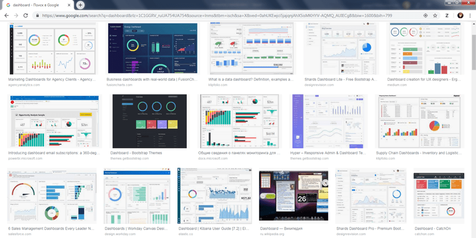
What a sight. 
We have norms almost everywhere, yet how come there is no standard for business?
Authors of reports want the best, but only give their executives a headache. It’s high time we were sympathetic and stopped wasting their valuable time!
An ability to organize financial indicators is paramount. People should breeze through reports and see the state of their affairs.
That’s why we need to standardize business reports. I see the red light, I stop. I see a business chart, I analyze and act.
Dr. Rolf Hichert’s brainchild

Back in the 90s, a German professor Rolf Hichert decided to put an end to the mess by starting developing IBCS. His efforts were successful. In 2013 the first standardization of business communication entered the world stage. Its popularity is growing and the project itself keeps evolving.
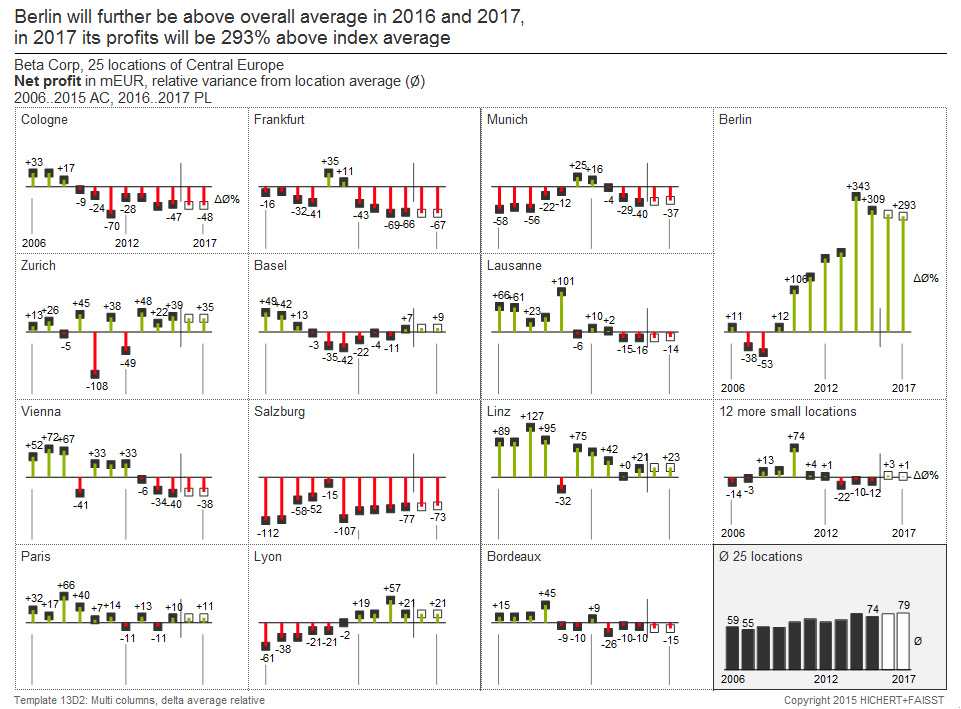
Let’s examine the operating principle of IBCS. First, consider this diagram:
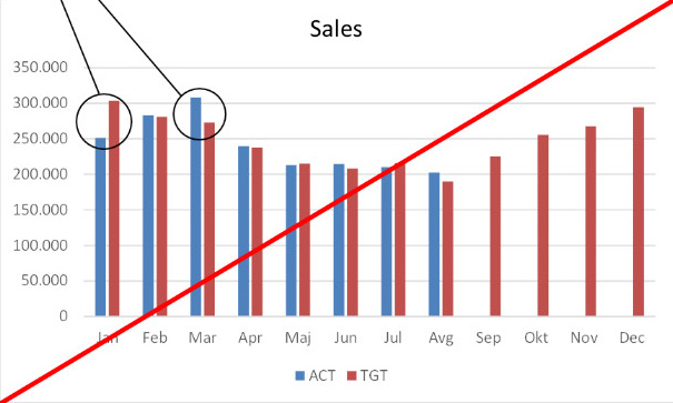 I bet it’s familiar to you. This is a typical grouped bar chart comparing the budget and the actual data.
How effective is it?
Right off the bat, you need to realize the blue bars represent actual data and the red ones — budget. Why? An author’s vision? The colors were default? We’ll never know. Next, what departure from the budget do we have? Are we over or under it? We’re facing major questions, but this image can’t answer them.
Cue IBCS that presents the same data set:
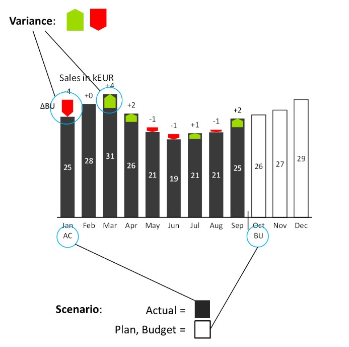 Dark gray columns illustrate actual data, while the budget is the outline. It’s called a scenario: actual data will fill the empty frame of the budget. Due to uniformity, understanding colors and the layout is easy. Thus, we can use them to gauge more crucial information.
Furthermore, the difference between the budget and the actual is calculated and displayed. The colors are intuitive. We associate red with danger so it’s a negative variance; green is calming thus variance is positive. So, such diagrams direct the viewer’s attention to what’s important for fruitful sales.
Unified and succinct text is placed horizontally while KPI titles have their own block.
All according to the fundamental regulations of IBCS.
Dr. Hichert’s project is based on the SUCCESS formula. It’s an acronym composed of 7 basic rules:
Say — Express an idea. Any financial analytics ought to convey the main message. Introduce a reader to the theme, then solidify it with trustworthy data. Unify — Use semantic notation. All kinds of content (terminology, measurements, variations, etc.) that mean the same must look the same. Condense — Increase the density of information. Limit the information relevant for understanding the content to one page. Check — Ensure visual integrity. The material must be accurate and easy to digest. Express — Choose proper visualization. Objects, whether it is a chart, a table or an image, must communicate the major idea and facts. Simplify — Don’t clutter a slide/a sheet. Avoid convoluted, superfluous and decorative elements. Structure — Organize your content. The subject matter has to follow a logical structure. The components must be comprehensive and consistent. Complying with these guidelines, you’ll be able to:
- Organize your content, sticking to the core storyline.
- Present the content through a vivid visual design.
- Standardize your content with the help of conventional signs:
After applying basic principles of IBCS to an ordinary report, you’ll get the following picture:
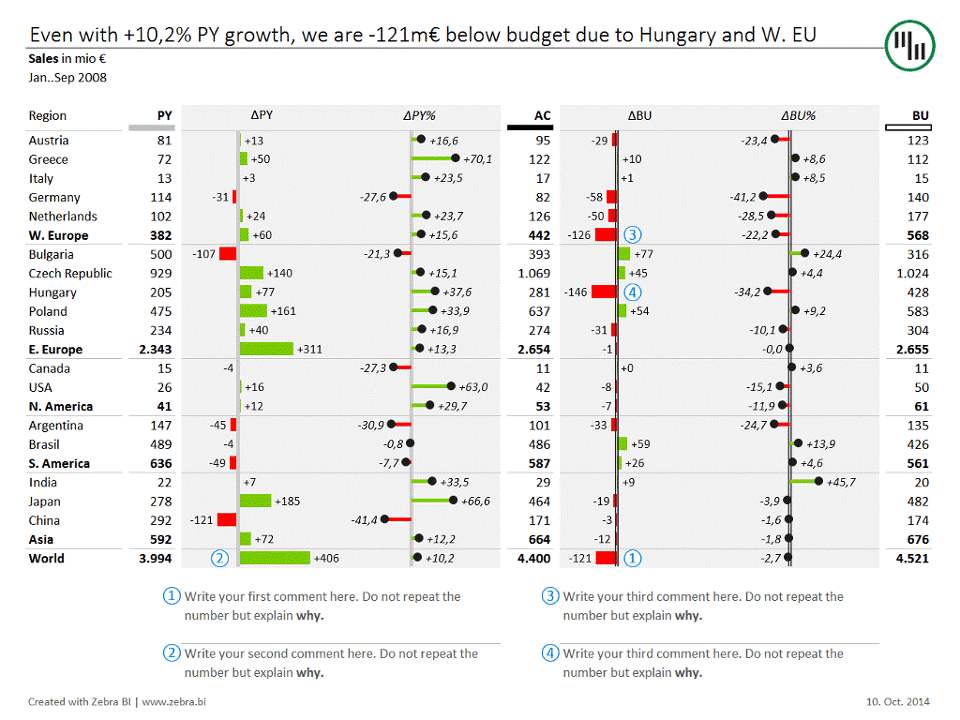 Let’s sum up its unique characteristics:
- The title is the central message.
- No ornamental elements like logos, three-dimensional figures, 3D effects, etc.
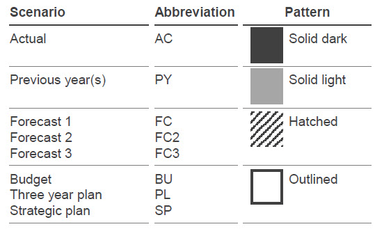
- Strict placement of the columns (PY is always on the left, AC and BU on the right).
- Scenario indicators are under the column headings (PY is gray, AC black and BU an outline).
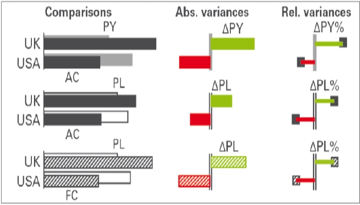
- Red/green diagrams with +/- symbols depict variances.
- The absolute variances (ΔPY, ΔBU) are shown as a bar chart, while relative variances as pin-diagrams.
- Appropriate semantic axis for each scenario: the gray is for the previous year and the outline is for the budget.
- Numbered comments are below, on the same page as the report.
As a result, we get a universal language, which any FP&A expert can understand and which will bring business communication to the new level.
Interested and crave to learn more? Then choose one of the certified by the IBCS Association software tools to implement the standards on any big IT-platform.
[/vc_column_text][/vc_column][/vc_row]