
Why Your Qlik Deployments Keep Breaking
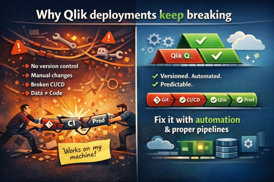
Every Qlik team has a deployment horror story. Maybe it was the app launch load script bug that decided to release an app to production with a broken ...

Dashboards are an essential tool for transforming data into business value. A smart dashboard uses data to show the real situation to specific groups of users. However, there is no single approach. Every business is an individual with its own goals, objectives and audience. To solve problems and achieve particular business goals, an individual approach to the dashboard development is required.
Practical Guidelines for Dashboard Development
The first step in dashboard creating is defining the audience: users portrait creating, what information they need and how they will use it. More often, dashboards are designed for specific people and roles. Different business users have different data expectations and needs. Leader’s needs will differ from the manager’s needs, and manager’s needs from the analyst’s needs. The analyst needs multiple data views to get deeper insights into the data, and the operations manager needs to quickly understand whether there are deviations that require immediate action.
Having determined the target audience it’s necessary to choose the most appropriate dashboard type.
4 main types of BI dashboards:
It may seem that the panel should display absolutely all indicators. However, specific goals and objectives require specific indicators. At this stage the main task is to determine the main indicators that most accurately measure success.
The dashboard should display key metrics in a way that is understandable to the audience and the focus is directed there. For example, if the key metric is customer acquisition cost, the dashboard design should emphasize that.
By understanding what information users need to see it is possible to determine the appropriate type of charts.
Main chart types:
Well-designed dashboards follow user interface design principles to guide users to the right information.
Basic principles:
Before presenting a dashboard to a wide audience it is worth sharing with a few of its representatives, getting their feedback and making changes. After presenting the dashboard to the entire audience, it makes sense to observe a process of dashboard using and analyze user feedback.
DataLabs is a Qlik Certified Partner. A high level of team competence and an individual approach allows to find a solution in any situation. You can get additional information by filling out the form at the link
Every Qlik team has a deployment horror story. Maybe it was the app launch load script bug that decided to release an app to production with a broken ...
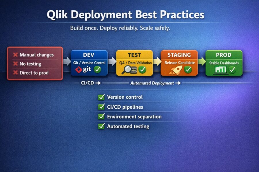
Are you the type of person who deploys Qlik apps by simply exporting a QVF, renaming it, and then importing it to your target environment? If so you&#...

During a briefing on the Iraq War, Donald Rumsfeld divided information into 4 categories: known known, known unknown, unknown known, unknown unknown. ...
[…] Докладніше про види інформаційних панелей можна почитати тут […]