
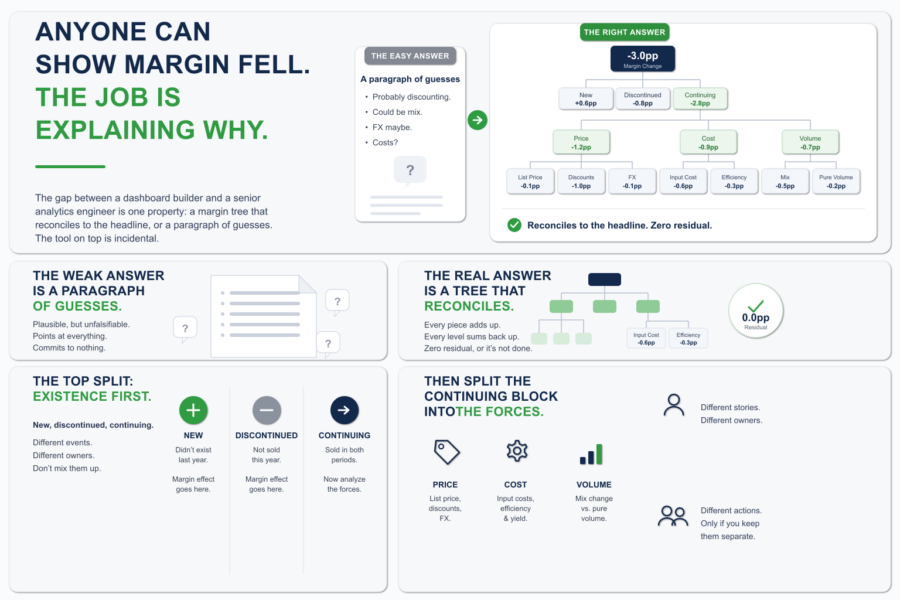
Anyone Can Show Margin Fell. The Job Is Explaining Why.
Margin is down three points. The CFO knows that already. The dashboard told them, the board deck told them, the number is not in dispute. What they wa...

It’s possible to get a complete picture of current business situation using data visualization. This is especially useful when there are complex datasets and unrelated information. At the moment, there are many types of data visualization. A large number of data visualization options (arc, tagged, waterfall, violin, etc.) provide many ways to analyze data, share information, and discover new ideas. However, each information requires a certain way of visualization in order to effectively present data and meet information needs. For example,
Slope Chart
This chart shows the change between 2 points. It is effective when there are 2 time periods or comparison points and it is necessary to show an increase or decrease in different categories between 2 data points. This type of chart is suitable for visualizing changes in sales, costs, profits in order to obtain information about which indicators increased, which decreased, and how quickly this happened.
Calendar Heat Map
Heatmaps show the changes in a data set over specific periods (months, years). The data is superimposed on the calendar, relative values are displayed in color over time. This option is suitable for visualizing quantity changes depending on the day of the week, how it changes over time (retail purchases, network activity, etc.).
Marimekko Chart
A diagram is used to show the relationship of parts to a whole. It compares groups and measures the influence of categories within each group. It is commonly used in finance, sales and marketing.
With Qlik, it’s possible to create any visualization that will be most effective for achieving a goal. Interactive charts, tables, and objects give an ability to explore and analyze data in depth, that helps to generate new ideas and make the right decisions.
DataLabs is a Qlik Certified Partner. A high level of team competence and an individual approach allows to find a solution in any situation. You can get additional information by filling out the form at the link
Margin is down three points. The CFO knows that already. The dashboard told them, the board deck told them, the number is not in dispute. What they wa...
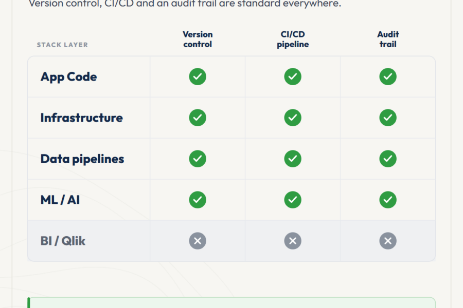
At some point, every BI team that grows past three or four developers hits the same moment. Deployment coordination starts eating senior time. Small i...
The Qlik ecosystem is at an inflection point. AI systems and automated pipelines are starting to consume analytics output as input, not just present i...
No comments yet.
Leave a comment