
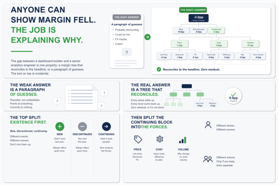
Anyone Can Show Margin Fell. The Job Is Explaining Why.
Margin is down three points. The CFO knows that already. The dashboard told them, the board deck told them, the number is not in dispute. What they wa...

A dashboard is an indispensable business tool for working with data. It is a visual report with all the data. The main such report goal is to help the user to make effective business decisions by visualizing KPIs (charts, graphs, maps, etc.), monitoring performance, interacting with data to analyze trends and obtain the necessary information. Clear visualization in the form of charts or graphs provides an easy workflow and data understanding. Modern reports also extract data from several sources and allow to explore, analyze data and get a complete understanding of the current situation. Some dashboards include AI-driven recommendations, big data scalability, built-in visualizations, and a managed self-service.
There is a fundamental difference between regular reports and a dashboard. A modern interactive dashboard is a data visualization that allows to interact with data, explore it, understand what changes are happening or have happened and determine causes. A static report is a visualization of historical data. Such reports can only tell what happened in the past. They are used on a regular basis (daily, weekly, monthly, etc.).
Dashboard types:
You can read more about the types of dashboards here
Dashboards can be useful for companies from any industry, as well as for any profession.
Dashboard usage depending on the business industry:
Dashboard usage depending on professional duties and company departments:
The main dashboard advantages:
Recommendations for creating a dashboard:
Margin is down three points. The CFO knows that already. The dashboard told them, the board deck told them, the number is not in dispute. What they wa...
At some point, every BI team that grows past three or four developers hits the same moment. Deployment coordination starts eating senior time. Small i...
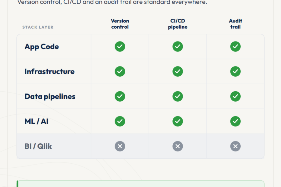
The Qlik ecosystem is at an inflection point. AI systems and automated pipelines are starting to consume analytics output as input, not just present i...
No comments yet.
Leave a comment